Back in 2006, my final project was to come up with a campaign for a fictional company. Since I had been recently enamored with the space shuttle and all things involving rockets, it was an easy choice on what to go with. My generic company name was ACME Aerospace but darn it, I should have gone with SpaceX. Sure it was founded in 2002 but no one really knew about it in those days. Nonetheless, I pressed on with stationery, a magazine cover, logo, etc. Then I needed to design a billboard. What to do?
Well, a lot of people visualize a person sitting at a console with a giant red button that says “LAUNCH”. I mean that’s kind of how it worked in “The Right Stuff” (that poor guy hated pushing that button). So, I had the button idea. Now I needed a slogan. I knew that space tourism was being touted as something that would happen sooner rather than later so I went with that angle. A company that gives rides into space. I wanted it to be edgy so I figured that gravity is the main culprit in keeping us bound to the surface. Ok then, give it the finger…by pushing the button to launch the rocket. It’s a play on words. I really hope I don’t have to explain it but my instructor and classmates got a laugh out of it.
The First
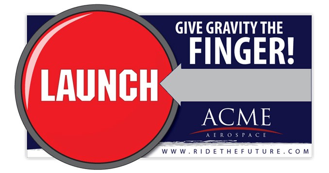
The original piece was pretty basic but all the elements were there for what I needed:
The Last
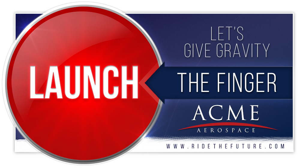
The newer version maintains some of the simplicity with a little more flair here and there. I reduced the fonts to just two. While Trajan is a very much used font, I kept it because if it isn’t broken, don’t fix it. I used a san serif for a more modern look on the button. I also wanted to give the impression of it being a button. I just went top-down 2d style with it, again, for simplicity. I also wanted to give it more of a glow effect but not overdo it. The new background has a rocket trail from a long exposure photo. I gave it a little more texture.
A more notable change is changing the slogan up. I put “THE FINGER” on the arrow itself and changed the color of the arrow as gray was looking a bit drab. I actually made that change while writing this post. I could pick this thing apart for hours but it was just for fun and I don’t want to devote too much time to it. It got me the grade, either way. Also, it’s all vector. Something I didn’t do originally.
I think the new one looks at least a little nicer:
One final note is that this was a rebuild more than an edit. The original file has long since vanished into the horror that is my drawer full of old hard drives. Another task for another day. I mean it was 12 years ago, after all.
If tasked to do this again, I’d redesign it entirely as opposed to just correcting some things and updating a few things. I think I’ll do a SpaceX poster next just for the fun of it. Perhaps an infographic.
